The purpose of this activity was to introduce manual choropleth mapping with Microsoft Excel and Adobe Illustrator CS5. We produced four maps in this exercise. All maps were to be on one document.
Map 1: Absolute number of persons reporting American ancestry; Quintile classification; 5 classes
Map 2: Absolute number of persons reporting American ancestry; Equal Interval classification; 5 classes
Map 3: Percentage of all persons reporting an ancestry that reported having American ancestry; Quintile classification; 5 classes
Map 4: Percentage of all persons reporting an ancestry that reported having American ancestry; Equal Interval classification; 5 classes
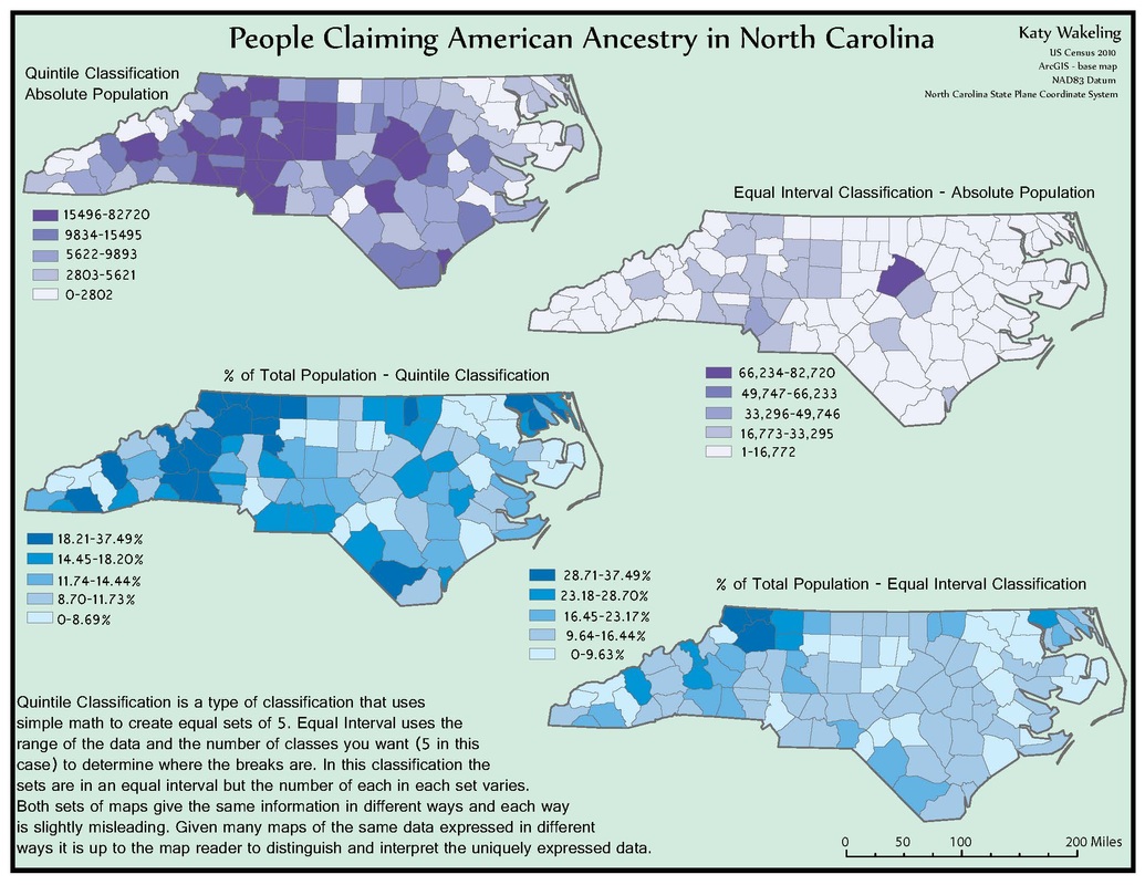
This map was one of the more frustrating ones ones because it took so long to get all the counties labeled. This map taught me about how using different methods of classifying the data you have could weld very different looking maps. All four of these maps are showing the same information but with the different classifications they look very different. This exercise taught me about how the same information portrayed using different classifications can weld very different looking maps.
 RSS Feed