This is a standard Mercator Projection of the World.
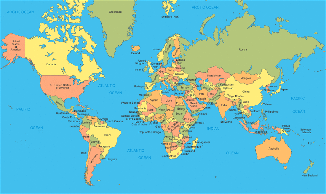
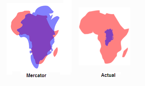
Overall the map is clear and readable. The colors of the countries are very easy to see on the water. Though the blue text on the blue water is a bit hard to see. The issue with this map is the projection. The countries along the equator are the ones that have the most accurate size and the ones farthest away from the equator are extremely distorted. For example Greenland vs Africa. On a Mercator Projection Greenland looks as big if not bigger than Africa while in reality it's not even half the size. (the picture below shows the difference)
 RSS Feed