In this exercise, we become more familiar with the mapping functions of ArcGIS by creating county-level maps with demographic data.
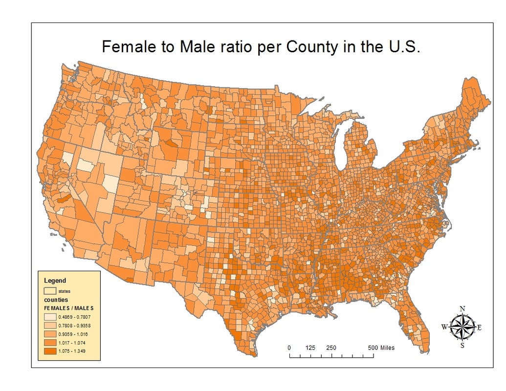
The first map I made was a choropleth map. Using the information that was available I decided to see what the ratio between men and women per state was.
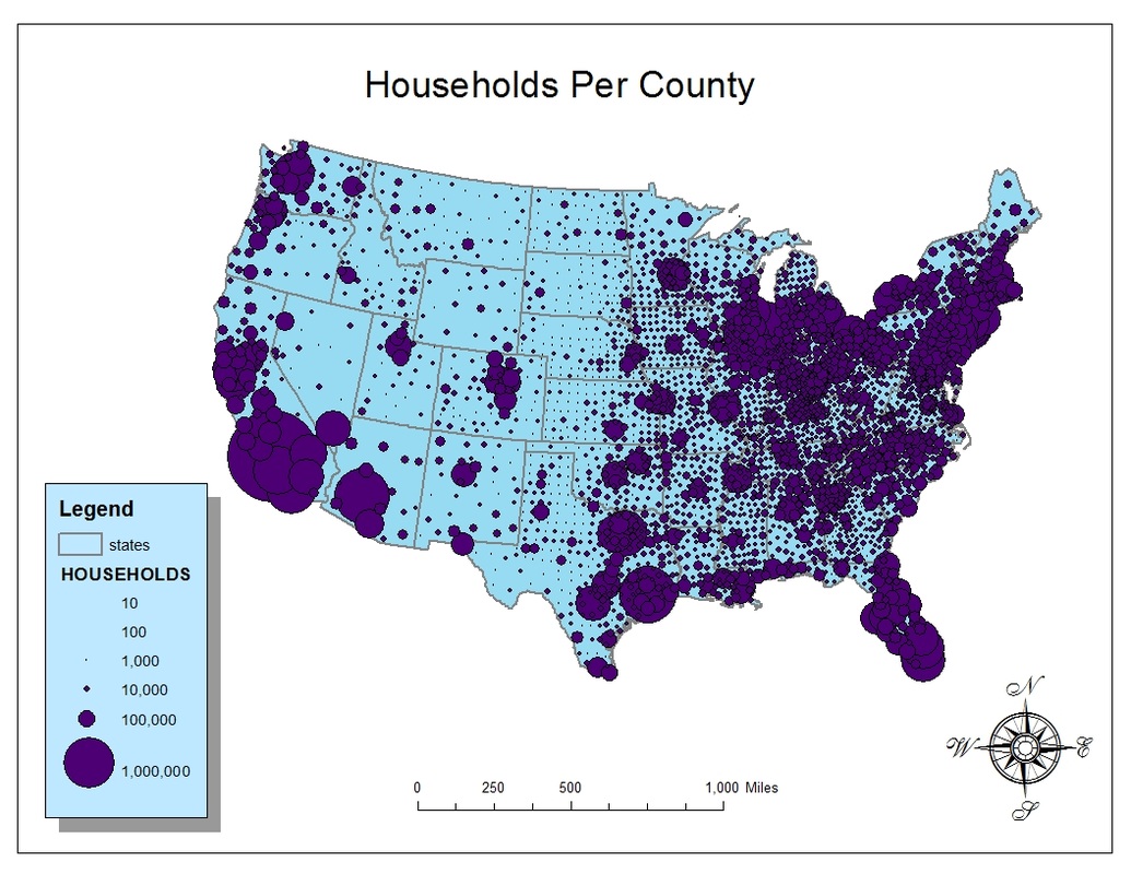
This was the second map I made using the country data we were given. This time, using proportional symbol mapping, I decided to show the number of households per state. It gives the map reader a very good sense of where large population pockets are, and big cities. The legend isn't perfect because you can't see all of the circles, but by using 6 you can see most of them.
 RSS Feed