The purpose of this activity was an introduction in manual proportional symbol mapping with Microsoft Excel and Adobe Illustrator CS5. We produced one map in this exercise. What is mapped is up to us! (I mapped the number of Starbucks per state) Making sure that we used a data source that is legitimate. Using ArcMap to create a base map that is exported into Illustrator for the completion of the map. Our notes told us the procedure to determine symbol sizes.
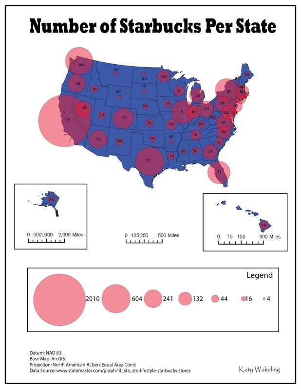
I originally wanted to map the number of cats or dogs per state but that information would have cost me money so I went with the first free information I found - the number of Starbucks per state.
So I picked a dark blue color for the states to stand out, and a redish color for the circles so you could easily see the circles on the map clearly. I then scaled Alaska and Hawaii with their own scales and put them in a box to show which scale belongs to which state. I used 7 circles for the legend to show the difference in sizes because it gave the best example of the different sizes. With 4 being the least and 2010 being the most.
So I picked a dark blue color for the states to stand out, and a redish color for the circles so you could easily see the circles on the map clearly. I then scaled Alaska and Hawaii with their own scales and put them in a box to show which scale belongs to which state. I used 7 circles for the legend to show the difference in sizes because it gave the best example of the different sizes. With 4 being the least and 2010 being the most.
 RSS Feed