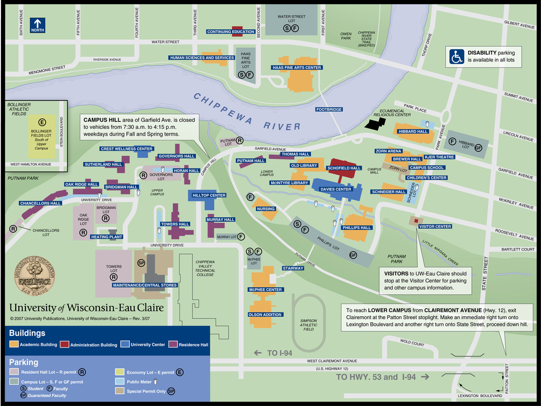
This map can be found on the UW-Eau Claire website.
My critique:
Choosing a light color for the background was good, though the difference between the background, the park areas and the metered parking are a bit hard to see. The colors of the buildings are easy to see. So over all this map has a good figure ground.
The font chosen for the map is easy to read, and by making the roads white the black font is very clear. The map has a good legend, it's very thorough and doesn't cover up any of the campus buildings. Using the text boxes was a good way to make important information for visitors more easy to see. This is a very legible map. This map is exactly what a campus map for a visitor should be. It's legend is very clear, and it doesn't provide any unnecessary information. The road name are unobtrusive but there as needed, there is a route to show how to get to lower campus that is very clear. The only not clear thing is the Bollinger field box, I'm not sure what it's trying to say or even where it is supposed to be on the map.
I think this map is very well done. Your eye is drawn first to the legend, with it being the darkest thing on the page, which then is very informative and tells you everything you need to know for the map. The north arrow and note about disability parking are easily seen but out of the way of the main information so they aren't covering anything up. Though the map is currently outdated thanks to the universities new building overall it is a very good and very informative map.
 RSS Feed